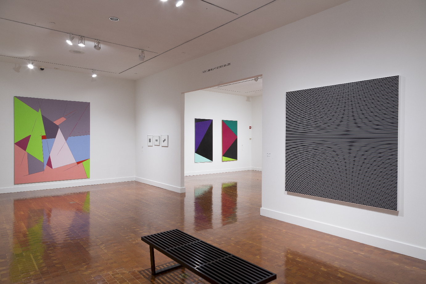
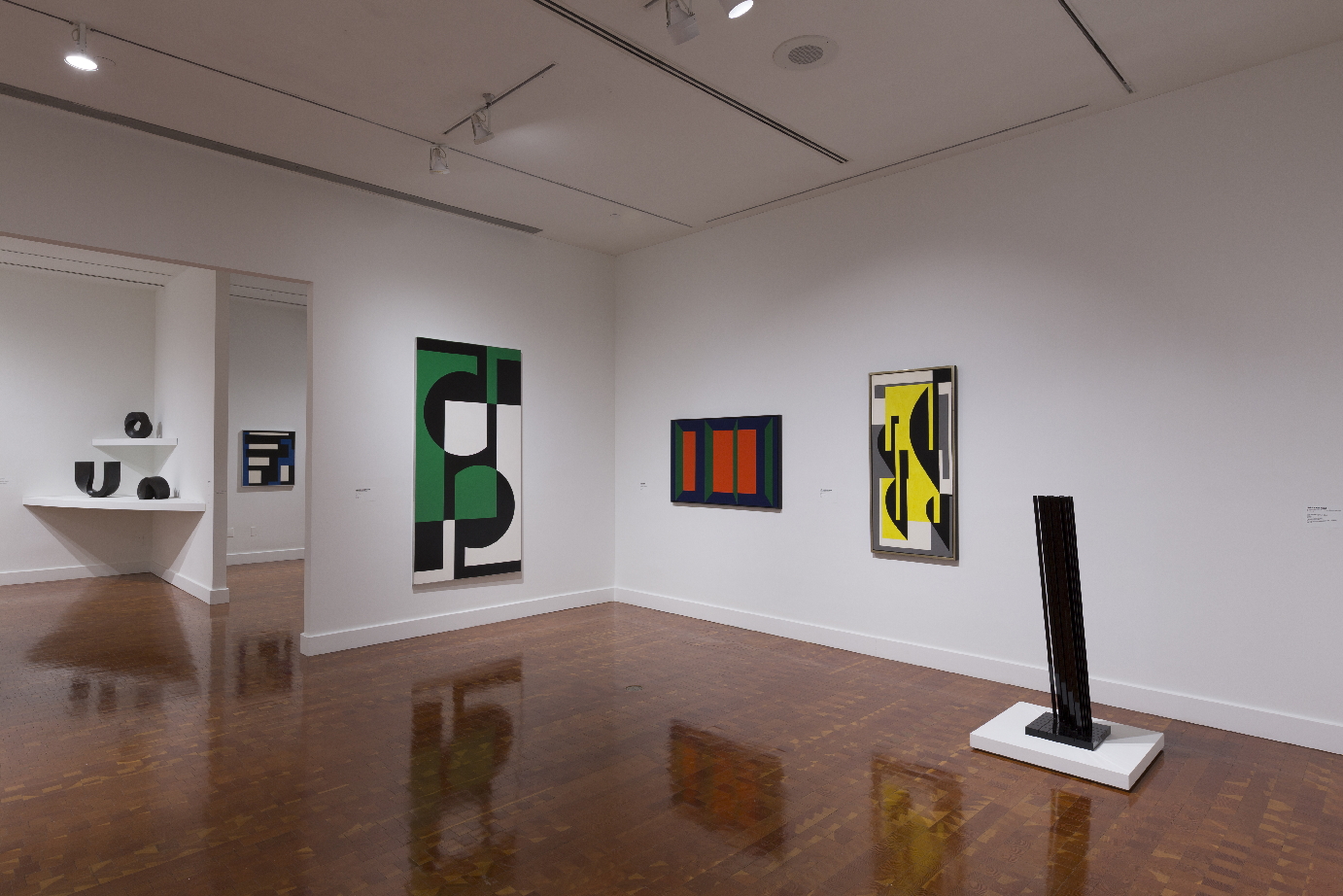
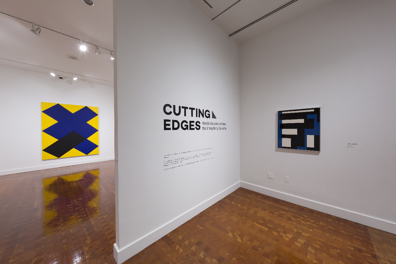
The Scandinavia House has an excellent, worth seeing exhibition of concrete art from Nordic countries collected by Norwegian collector Erling Neby, mainly consists of hard-edge geometric paintings. Since the 20th century, the Scandinavians are especially known for their design abilities, and one of the strengths of the exhibition is the schematic precision of the forms, which play out with sharp and lyric detail that part of the world’s unusual ability in the arrangement of visual elements. More than thirty works, curated by Karin Hellandsjø from Erling Neby’s collection (all the works have been assembled by Neby ), are on view, and so this is a short course in Nordic achievement in abstract art since the middle of the last century. In general, the work is marvelously clean and exactly linear, a stylistic choice that might convince the exhibition’s audience that they were seeing designs rather than fine art. But this is not true–there has been a long history of concrete art, a term first used by the Dutch painter Theo van Doesburg in 1930, to characterize sharply defined non-objective paintings. The works on view demonstrate the artists’ resolve to allow the forms speak for themselves, without reference to objects in the real world. In this way, the work is relatively self-enclosed, speaking to the innate, inherent characteristics of abstract art: form, mass, line, color, the relations between different parts of the paintings. These characteristics are inevitably nonobjective, and thus pull the viewer away from any kind of correspondence between the circumscribed world of the images at hand and actual things in the world that might conceivably be related to them (but they are not).
Nordic art has usually been relegated to the sidelines, with the isolated exception of the Norwegian symbolist painter Edvard Munch. But like a lot of art pushed to the edges or ignored, the work here from Norway, Sweden, Denmark, Iceland, and Finland is stronger than the small attention given it. In “Cutting Edges” the artists participate in what must be described as an international idiom, rather than one geographical specific to the work we see. By now, of course, it is a truism that abstraction cannot be seen as an art dedicated to a particular region, although we recognized that its first impulses originated in Western Europe–in particular, France. So the historian is hard put to detail just what makes Nordic concrete art Nordic, and in fact, the undertaking of a particularization such as this may make no sense from the start. Yet this is a time of exquisite awareness in the particularities of culture, especially in the New York artworld, where so many backgrounds come to the fore. The pressure to particularize and to politicize identity is currently sovereign in New York, but we can thank a show like “Cutting Edges” for its attention to a formalism that carries no particular baggage, cultural or national. This is an important point to acknowledge because, today, breathing space is needed in light of much art that emphasizes the details of the artist’s background as inherently more important than the work itself.
Indeed, the wonderful part of the artists’ backgrounds is that they have very little to do with the manner of their work. The pieces stem from second and third generations of modernism, and the emphasis on the purely formal qualities of the art (mostly paintings but a few sculptures) allows us to see the show with an objectivity that comes as a bit of relief after the arduous moralizing we are expected to launch into on seeing a lot of contemporary art. Two paintings by Paul Osipow, both called Katherine (one from 1989, and the other from 1988-89) consist of angular, hard-edge forms: the 1989 acrylic has two bars with outward extensions in the middle–dark green against maroon above, and black against a pinkish tan beneath, while the 1988-89 work looks like a multiplication sign in dark blue, sitting on the paint of a partial triangle,, black and blue, against a yellow background. One might not fully be taken with the works’ schematic simplicities, but there is a formal directness and force that creates a self-generated sense of autonomy, a word central to this show. Sam Vanni, also from Finland, offers Composition violette (1954), in which a dark tan abstract shape cuts into a semi-rectangular blue shape with thin blue stripes connecting it to a brownish orange, near-rectangular shape on the left. All three abstract forms have black designs imposed upon them; the background is bown with a black vertical stripe on the right.
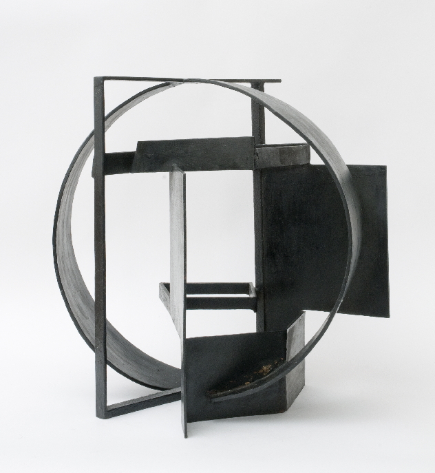
Denmark is represented by Richard Mortensen’s Cuer de Carré, a well-handled abstraction of linear polyhedrons, colored variously white, green, blue, red, and tan and gray. Lines extend from the edges into the lower center of the painting. The artist Richard Jacobsen’s iron tabletop sculpture, No. 212 (ca. 1952), consists of linear planes and a circular strip roughly framing the entire work. It is a classic exposition of late cubism, its parts beautifully worked in accordance with one another. Kristján Gudmundsson’s pencil lead drawings, while small, exquisitely develop themes based on lines creating very, very tight grids. One part of the drawing is dark, while the part on the right is gray. The tightness of the compositions is remarkable, igniting interest despite the smallness of the work’s dimensions. In a way, once we accept the transnationalism of the art we see, the works become wonderful experiments in non-allied abstract forms. If there is to be a criticism of these extremely well-made efforts, it might be that they edge too closely to design, being so clean and meticulous in their production.
In Norway, we find two hard edge abstract paintings by Gunnar S. Gundersen: Composition (1960) and Untitled (1961). The 1960 painting consists of darker-colored polygonal shapes–dark blue, a muted juade, black, and bits of white on a brown ground. As restrained as the painting is, its pattern–arranged in an angular orientation–moves in the direction of an abstract joy. The later work is a relatively simple pattern of rectangular and square shapes imposed on top of each other. The arrangement of these shapes seem intuitive, despite the seemingly rational impulse of the painting. One of the very best pieces in the show is Kristin Nordhoy’s very recent Interlace no. 2 (2017), a gridded pattern painting, not exact in execution, that consists of black lines crossing over each other. In Sweden, Olle Baertling’s three vertical panels each are composed with triangular areas of differing widths and proportions; the colors, all told, range from red to black to dark mauve to light blue to green (dark and light), creating a fugue-like visual environment extending from one work to the next. Lar s Erik Falk’s relatively recent painted aluminum sculpture, Modullskuptur E16 (2000), consists of rows of slightly slanted metal rods that adds an extra rod as one moves from the first row to the last. It is a formidable piece of work, if slightly schematic in its presence.
The large question implied by the works described above has to do with the relations between schematic patterning and cutting-edge abstraction. If the two are often present in the same work of art–and in this show they usually are–how can we merge both perceptions into a sympathetic response to the paintings and sculptures? Combining the two ways of seeing these works shouldn’t be too hard to do. There is in fact no reason why an abstract work of art might be strengthened by a very strong compositional sense bordering on design. It doesn’t really matter how we analyze, so long as we proceed with an intuitive sympathy for what we see. “Cutting Edges” is not only a show of analytic–or concrete–abstraction; it is also an exhibition uninhibited in its free flow of nonobjective process. Colored forms mix and merge, with their hard edges not only offering boundaries but also long edges that buttress each other. In a show like this, description may be the larger part of the works’ creativity, but that hardly matters when the art we see is as good as it is. It is our relation to the work rather than its self-supporting autonomy–as good as it is–that counts